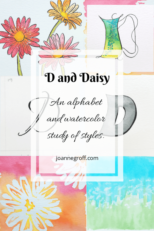
Letter D and Daisy
Letter D and Daisy
This project is part of a watercolor and ink study in letter styles and object styles beginning with that letter. Each week will focus on one letter and one object beginning with that letter in order to collect and practice various artistic styles and alphabets.
Daisies. Simplicity at its best. White daisies remind me that life has peaceful beauty. Charm and elegance with minimal effort. I carried them many years ago at my wedding.
The brilliant colors of gerbera daisies show off in a stunning display of liveliness and fun.
Both kinds of daisies appeal to me and remind me of summer days that filter inside to burst in bouquets.
This week, I studied the letter D and daisy styles. Colorful gerbera daisies and simple shasta daisies inspired my watercolor. I continued in the alphabet styles I am working on, trying to maintain the consistency of each alphabet style.
Here are my observations.
Dip pen letter D Style
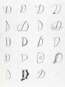
- I don’t always like D. I lettered D after D after D trying to find a calligraphy style I liked. I’m not completely satisfied with the flourish on 8, but I have another D flourish tucked away somewhere to try. But … where did I draw it? My sketchbook? My notebook? A piece of scratch paper? Oh, dear. I have a terrible problem of collecting an losing.
- Favorites: 2, 6, 11, 18,19.
- I was a little disappointed with 16. I enjoy a doodle style, but this one looked pot-bellied.
Watercolor and dip pen Letter D Style
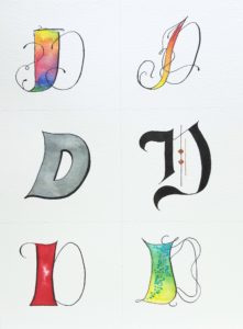
- Maybe I’ll learn to flourish better doing these styles. I’m quite happy with how the flourishes turned out in the upper right fiery D.
- The lower right D style always reminds me of mermaids with shimmery silver scales.
- The ink on the lower left D is a nice, bright red. I love that it isn’t a pink shade. Some reds tend too much toward fuchsia.
Daisy Styles
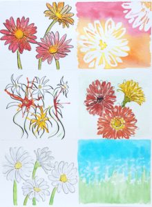
- I can see lots of potential for projects with these styles and colors. Cards. Accents. Paintings. Love the color!
- I have a hard time picking a favorite.
- The top right looks almost tie-dyed because of the bright ink in contrast to the paper. A nice affect. I used masking fluid to create the contrast.
- I’m fascinated by the bottom left. Not long ago, i found out that you can paint white flowers with a pale gray. I like this affect for the daisies, especially with the accent of ink.
- The bottom right abstract reminds me of a field of daisies on a blue-sky day.
I’d love to see what Ds you created. I wouldn’t be surprised if you had 20 styles different than mine. If you care to share, just post yours on Instagram with #patchesofordinary and tag me @joannneegroff so I can see them too!
If you missed ABC, you can find links for them here.
Happy studies!

Joanne Groff
Just a brainy creative with a fascination about how people think and understand. I use watercolor and letter design to encourage connection ... with self, the environment, and especially the people who live there.


One Comment
Joanne
Daisies brighten my day! I love learning about them!