Letter B and Blowfish
Letter B and Blowfish
This project is part of a watercolor and hand lettering style study. Each week will focus on watercolor and ink using one letter of the alphabet and one object beginning with that letter in order to collect and practice various artistic styles with each.
Several objects beginning with the letter B begged me to paint them. Bees, of course, as we have two hives in the backyard. As I thought about bees, I realized I’m not quite sure what I want my bees to look like and everything I drew became too complicated and realistic. I like realistic, but I want my own style of painted honey bees someday … in the event that my husband decides to expand his sweet hobby.
Then, the decision war started between one of my favorite flowers, the black-eyed susan, and the blowfish. I asked one of my sons what he would choose. After a “Seriously?! Is this even a choice?” look, he said, “Blowfish.” And really? Who doesn’t love to mess around with sea colors and dream of the ocean? Sounds like vacation to me! Blowfish it is!
Let’s review B and Blowfish in their many styles.
First, I will repeat styles because I want an exemplar of the full alphabet for many of the letters, and I want to practice with different objects in my favorite styles. Second, I may introduce new styles as I feel the need or desire. Rules do not apply here. Remember that if you decide to follow along with your own study. Make it Yours.
Dip Pen Letter B Styles
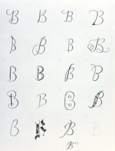
- Notice, I did away with the wobbly letters from the Letter A set
- My favorites: 4, 5, 6, 8, 12, 18, 19
- I love the bold corner on 4.
- I think 5 feels artsy.
- I like the mix of casual and formal in 6.
- I really enjoy playing with a Gothic style in 18.
- A few of these styles are just fun, like 19. Notice how it’s fine to make a letter over.
Watercolor and Ink Letter B Styles
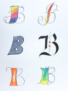
- I forgot to do masking fluid again. Maybe I need to just plop another letter in the middle somewhere. Masking fluid turns out fabulous results. I tried it on a Mother’s Day card. You can see the tutorial here.
- My favorites: That B! Wait. They are all Bs.
- The Gothic B with bronze. Very eye catching.
- The scaly look on the bottom right B reminds me of an author I know. Have you read The Mermaid’s Sister? A lovely tale by Carrie Anne Noble.
- The bright colors. What can I say? Bright colors beckon to me, taunting me to use them again and again.
Blowfish Styles
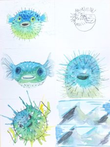
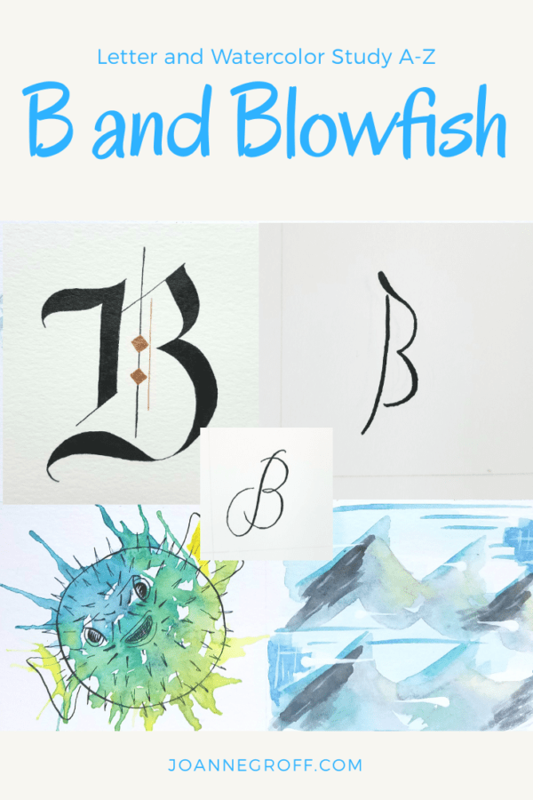
- My least favorite: I felt like I had one real bomb on this one. Everyone needs to experience a few disappointments in art, and I won’t try to hide it. The loose style with ink (the middle box on the right) did not come out at all like what I wanted. Maybe I need to do that little porcupine blowfish over again someday, but for now, it is what it is.
- I find value in the blind contour drawings because they force me to look, really look, at the details of an object. Sometimes, they turn into art. Sometimes, I don’t care for them. This one just made me laugh. I can’t say it’s eye catching, but I enjoyed the giggle.
- The rest? I quite like them with my favorites landing in the middle and lower left boxes.
Which styles stand out to you? Which ones don’t appeal to you?
I’d love to hear about your experiences with the study. Leave your questions or thoughts in the comments below. Post your progress on Instagram with #patchesofordinary. Remember to tag me @joanneegroff so I can see it too.
Enjoy!
