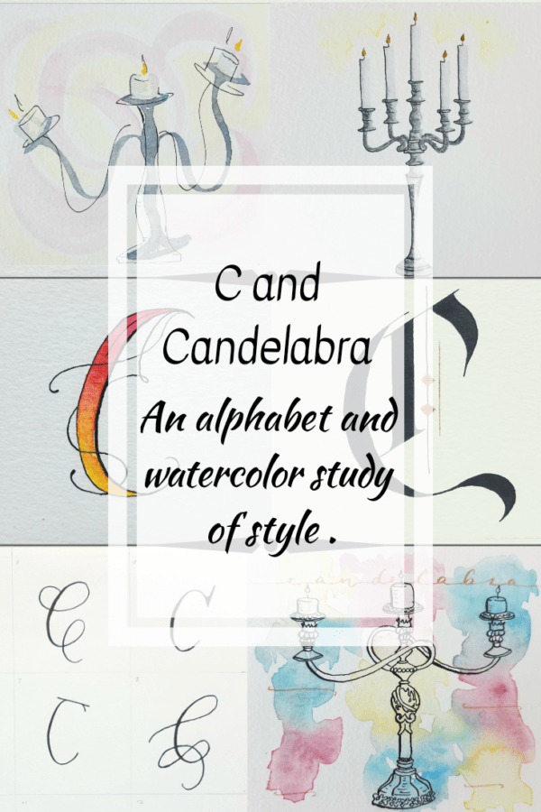
C and Candelabra
Letter C and Candelabra
This project is part of a study in letter styles and object styles beginning with that letter. Each week will focus on one letter and one object beginning with that letter in order to collect and practice various artistic styles and alphabets.
Recently, I had the opportunity to accompany my son and his class on a field trip. It consisted of touring several local historical sites. I’ve lived here for 18 years (yikes! already?) and had never been inside of any of them before this trip.
One of our stops, the Slifer House, a mansion built just before the Civil War, overflowed with antiques. Large gilded mirrors, antique sofas, silver candelabras, and even a music box (that they played for us!) dated 1864. I could have wandered through the house much longer than our allotted hour, and I left wanting to paint the beautiful furniture. To capture a piece of our past.
This week, I explored and studied letter C and candelabra (inspired by my visit to this mansion). Let’s take a look at what I came up with.
Dip pen lettered C Style
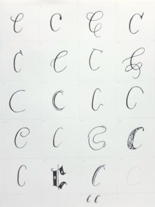
- C is a hard letter to make in multiple styles with a dip pen. I kept wanting to change the flourishes. Even though I want to explore flourishes more at some point, I didn’t feel like changing the flourishes alone changed the style of the letter. Some of these look similar, but I tried to change the styles to keep my alphabets consistent.
- Loved these … 8, 16, 18, 19
- I’d like to do these over … 2 and 13
- I need to keep practicing to remove some wobble in my strokes. Perhaps trying a different paper or nib would solve this.
Watercolor and dip pen Lettered C Style
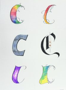
- I still love all of these styles, and I still forgot to do one with masking fluid. Maybe that will have to be a tutorial all its own.
- That gothic style and its boldness really stands out along with the top right that reminds me of fire.
- I’d love to use some of these in projects. Do you have any ideas?
Candelabra styles
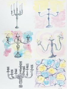
- Favorites: The left column. All of them, but if I had to pick one, I would pick the bottom left. What lovely detail!
- Least favorite: I don’t have one. I like them each for what they are.
Leave your questions or thoughts in the comments below. If you want to join me, post your progress on Instagram with #patchesofordinary. Remember to tag me @joanneegroff so I can see it too
Are you ready for Letter D?
