Color, Contrast, and Creativity
This week, I’m investing in color balance.
I like to chase a little contrast and add a bit of creativity to the job.
I love the boldness of contrast: dark with light, black with white, good alongside bad, campfires at night, smooth ice cream with crunchy chocolate coating …
Lately, my balancing act takes place on watercolor paper, mixing paints. All color starts with three colors: red, yellow, and blue. I’ve been taught about primary colors since I was a child, but I don’t think I’ve ever actually tested the theory.
This month, I’m taking part in a color study, and we are doing just that. We are working with the three primary colors to make color wheels, color charts (several … even one with 144 different colors), shade, tints, transparency, and on …
Of course, my greatest challenge is keeping the mud out. By that, I mean I constantly struggle to keep the colors sharp rather than muddy (with a dull, dirty look) when mixing colors. Though, I will say, when I started my large chart, I kept thinking how muddy the colors looked. As it dried, many of the colors I thought would look muddy instead looked sharp and bright.
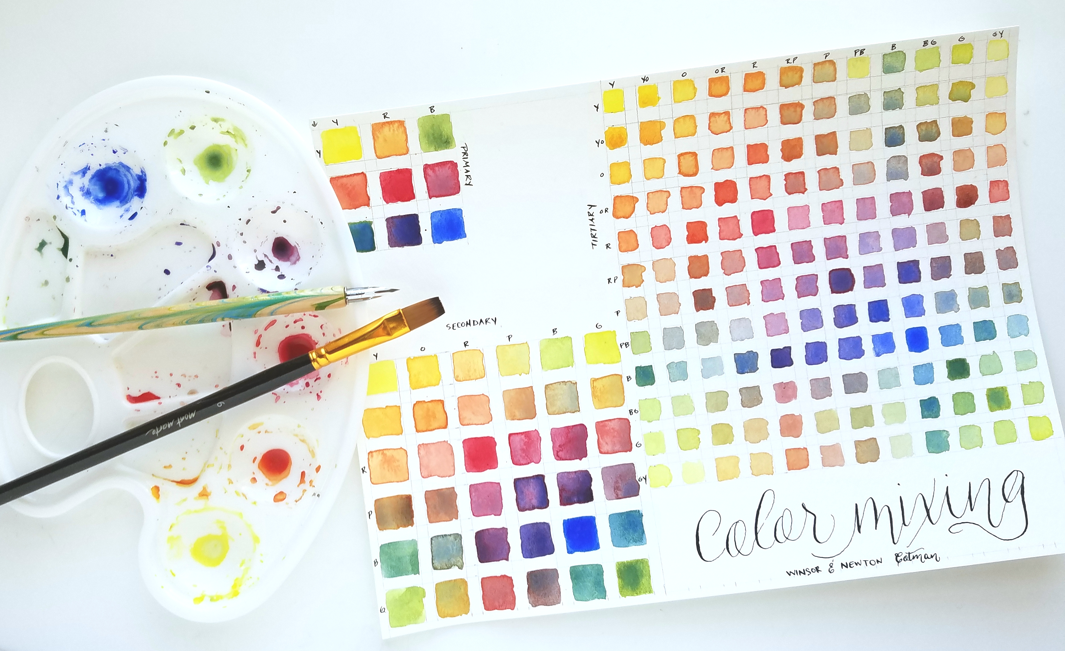
Watercolor has this beautiful mystery about it … I never know what it will look like until it dries. What anticipation it inspires! (I did have other frustrations … namely, several of the colors I mixed looked too similar. Oh, well … up and over.)
Balancing life can be like mixing paint. It helps to keep the mud out.
Of course, mixing the colors inspired me to work on some other projects. I wanted to make unique color wheels with some extra added contrast.
Here is what I came up with …
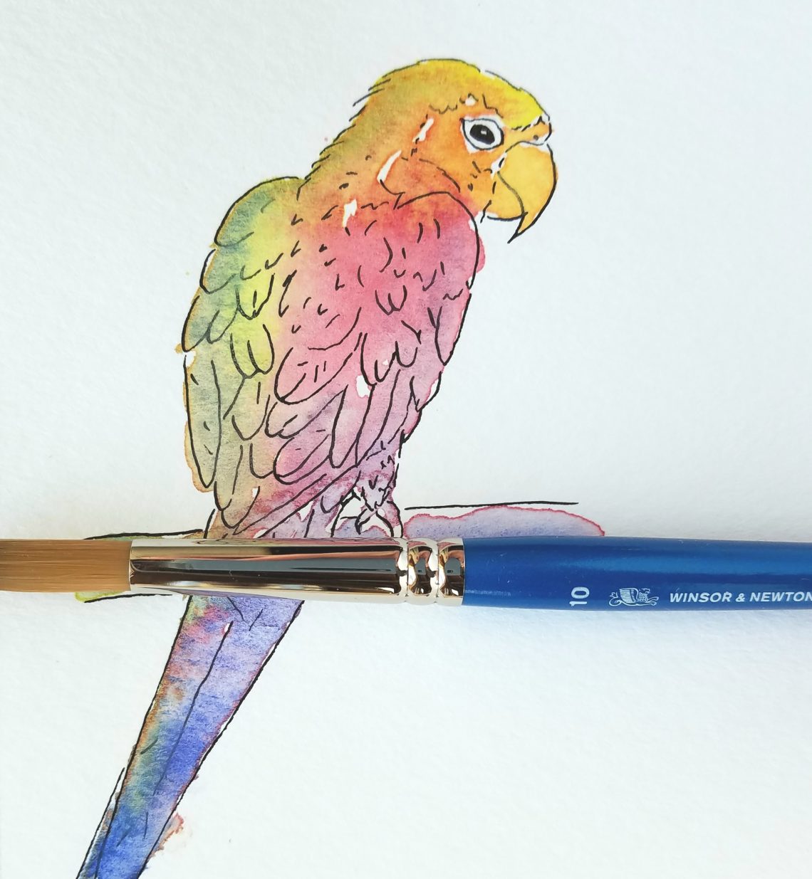
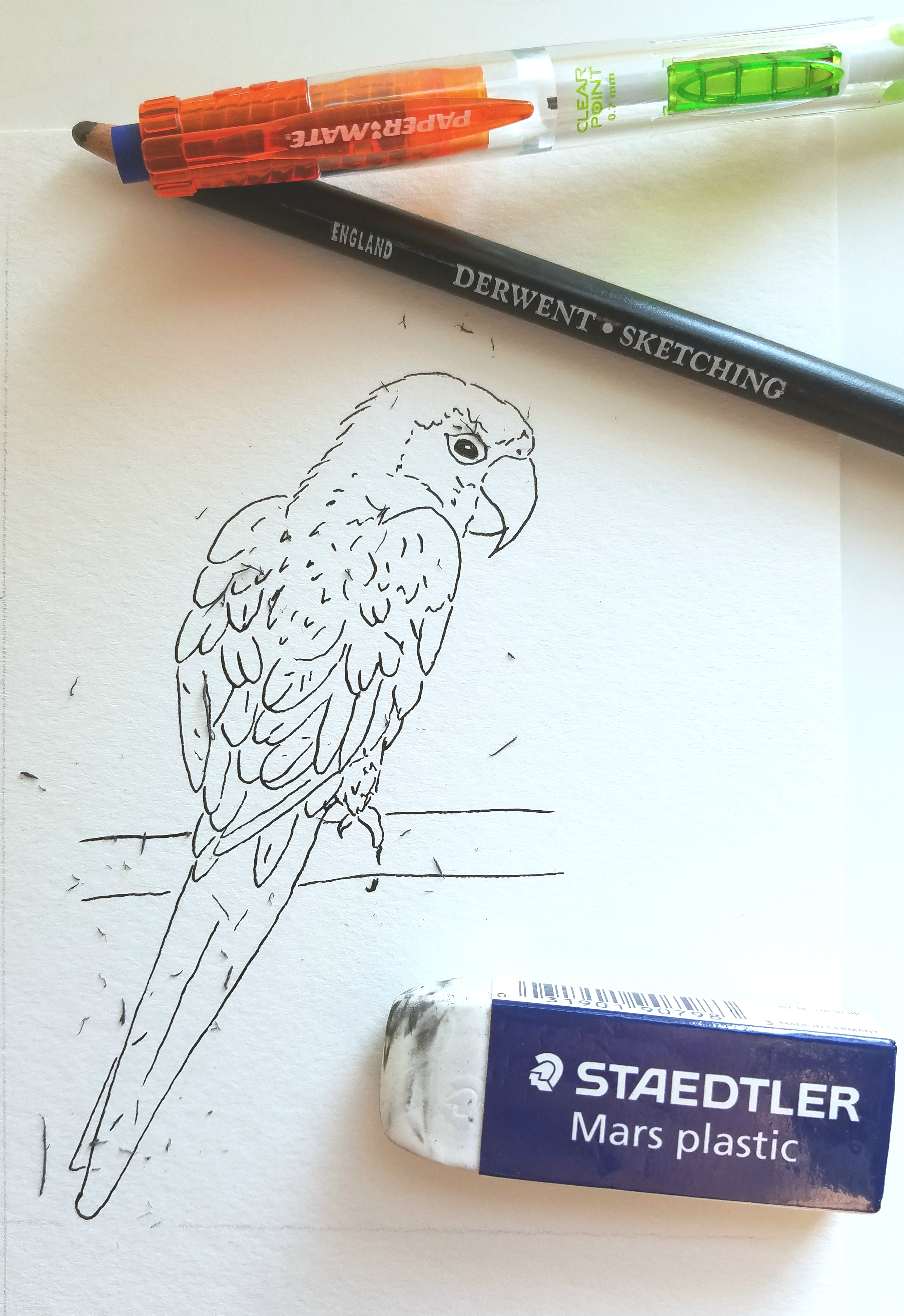
I started with a pencil sketch. I’d rather mess up and correct at this stage than wish I would have later.
Then, I used my dip pen with a Nikko G nib and sumi black ink to darken the lines. The ink can be applied after the watercolor has dried, and it will make a crisper contrast to the color, but I find that the ink from my nib blobs faster if I put it on top of watercolor. (I’ll conquer that eventually, but for now, I like how this turned out.)
When it dried completely (be careful not to get in a hurry … I have smudged many a line in my haste to erase). I erased the pencil marks.
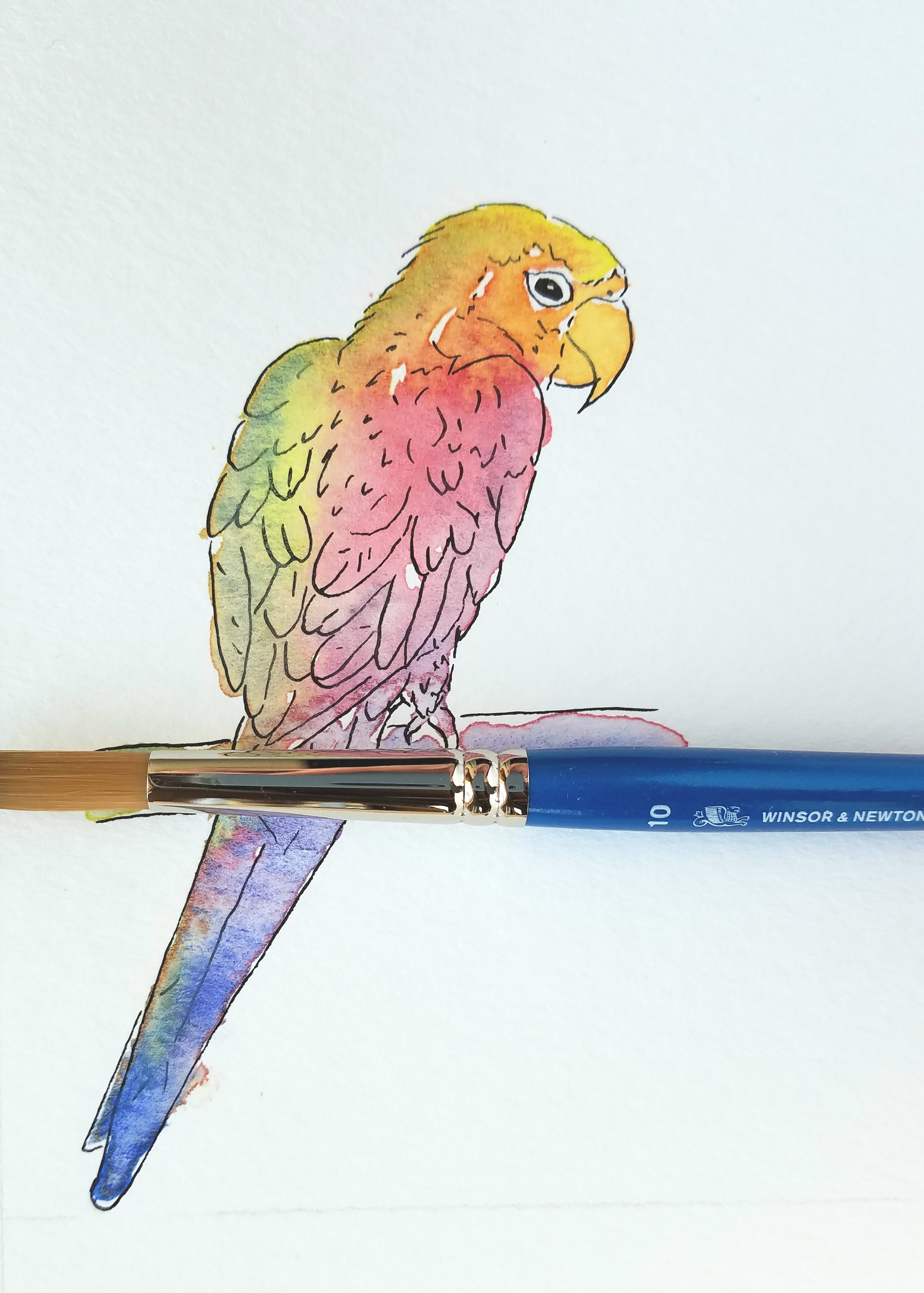
Finally, I applied the watercolors and waited for it to dry. (It’s kind of like waiting for Christmas. Seriously, “oh, the anticipation!” and “I can’t stand it!” at the same time. I love that feeling!)
Have you done any color mixing lately? I’d love to see your work.
Happy creating!
Joanne
Joanne Groff
Just a brainy creative with a fascination about how people think and understand. I use watercolor and letter design to encourage connection ... with self, the environment, and especially the people who live there.

