Monochrome Watercolor Designs
Monochrome Watercolor Designs –
Color Me Curious
How did your design creating go last week?
Did you notice and appreciate the designs around you more often than usual? Personally, I’m noticing little things everywhere and wanting to turn everything into a design too!
How did it feel to put your designs to paper and add ink?
Were you drawn to the page again and again to add just one more design? It can be addicting.
I know I’m totally obsessed with it. Each time I thought I was out of ideas, I came up with more. Just wait until you try this next exercise. It will get those creative juices flowing with color and turn that black and white winter scheme into spring.

Don’t get me wrong. A good black and white palette appeals to me, especially with a little gray mixed in, but there is a part of me that loves and longs for color … the brighter the better.
This week, we’ll take those designs a step further.
Set aside the black and whites, but not so far that you can’t reference them for shapes and ideas. Feel free to use the same designs for the next exercise or add some new ones.
Before we paint in color, let’s talk about monochromatic color schemes. Monochromatic colors start with a single hue. From there, we can add more colors by varying the shade of the color. Since we’re using watercolors, we can accomplish this easily with water.


Adding more water to the pigment will dilute it and produce a lighter color. Adding less water (or more pigment) will concentrate the pigment and produce a darker color. What we end up with is a number of variations of the same color, as shown above.
Here are some examples of the color change you will see as you add water. At the top of each, I filled my brush with paint. Then, I rinsed my brush and swiped the water-filled brush over the bottom of the painted area. Then, I pulled some paint downward. See how the water changes the color?

Now, let’s use this concept in our designs.
You will need:
-
- Watercolor paints* (I also added a few inks that are not waterproof just to compare against the watercolor in look and feel)
-
- A brush or two* (I used Winsor & Newton Cotman sizes 0000 and 0)
-
- Water
-
- Paper towel
-
- A palette
- Watercolor paper (I used Canson watercolor paper. It is affordable, but you will need to tape the edges so it dries flat.)
*Use what you have for paint and brushes. This doesn’t have to be complicated, and it’s for practice. No matter what brand or grade paints you use, you will have to get to know your colors and how they work. For now, you don’t have to invest a lot of money into buying paint. That said, the better your grade of paint, the more pigment you will have in your colors. I am using student grade paint for these exercises. For student grade paint and brushes, I’m partial to Winsor and Newton Cotman, but I also purchased another student grade set from Dick Blick called Camellia Students’ Watercolor Pans (this set is a little more chalky when it dries but it comes with a nice variety of colors).
-
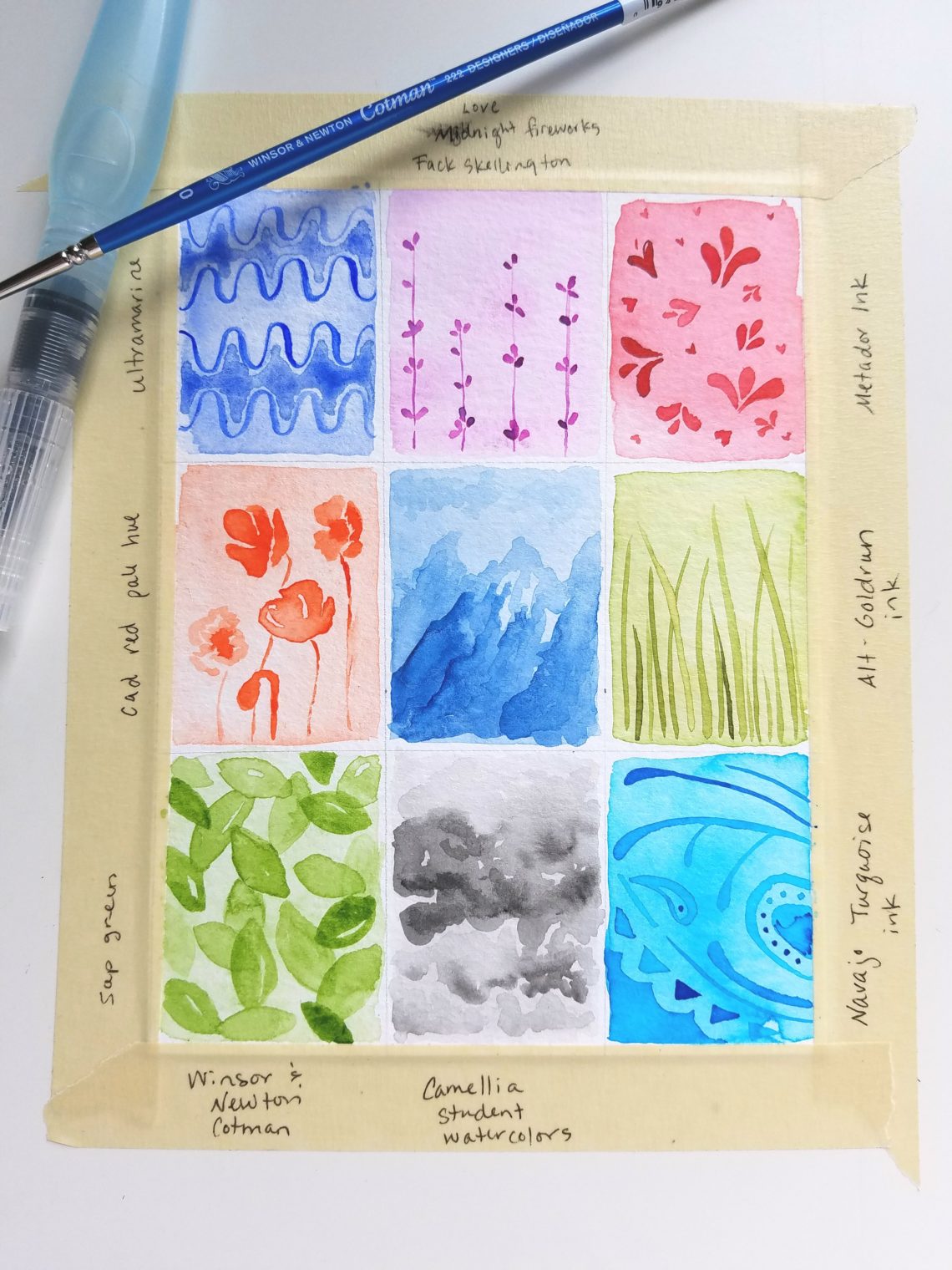
I love to work small, so I divided my paper into nine 4.5”x 6” boxes.
-
Tape it down to your work area.

-
Then, I painted each box with a was in a different color in a very light shade.
I mixed this color on a palette, adding as much water as possible while still maintaining color. ![]() I labeled the color names on the tape near each box, so I wouldn’t forget which ones I used. This step is optional, but I found that it added depth to the monochromatic design (compare it to the one at the beginning of this post).
I labeled the color names on the tape near each box, so I wouldn’t forget which ones I used. This step is optional, but I found that it added depth to the monochromatic design (compare it to the one at the beginning of this post).
If you want to learn more about watercolor washes, read Make a Simple Watercolor Wash.

-
Let it dry.
-
Add your patterns, using a mixture of concentrated pigment and diluted pigment to vary the pattern.

Next week, we’ll start adding our designs to projects. I see designs and words mingling in the near future. Until then …
Stay curious. Keep noticing the little things in your day. Add them to your project.
Happy creating!

Joanne Groff
Just a brainy creative with a fascination about how people think and understand. I use watercolor and letter design to encourage connection ... with self, the environment, and especially the people who live there.

