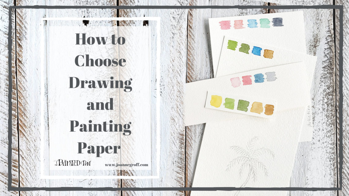
How to Choose Drawing and Painting Paper
Does it really matter which drawing and painting paper I choose? Should I use the same paper for a final draft that I use for everyday practice? What’s the difference between them anyway?
Paper can make all the difference when writing, drawing or painting, especially when working with watercolor and ink. To help you choose, we’ll look at a few of the papers I use for practice and professional artwork involving watercolor and ink.
I’ll name the papers I use, what I use them for, why I choose them, and even show you a couple I refuse to use.
We’ll break them down between drawing and watercolor and even show you the difference between thick and thin inks. When I talk about drawing paper, I’ll include lettering and calligraphy work because I use the same tools to draw as I do when working with lettering. To me, Lettering is a form of drawing anyway.
Drawing & Painting Paper

Yes, I use different papers for different projects.
Why?
All paper is different and acts differently with different tools. Nibs like some papers better than others. Water responds differently on denser papers than loose fibered papers. Even color looks different depending on the paper and what’s used to make it.
Recently, I tested different papers on my printer as I was choosing which ones to use for home printed but professional cards. I tried high quality glossy, matte, linen looking, and cotton paper used for art prints.
Guess what. The colors all looked different. Can you see the difference in these photos? The print file was the same for each paper, but the colors still printed slightly different. Some papers show lighter colors while others are more concentrated.


It’s true for calligraphy, drawing, and watercolor art too. Paper matters.
Below, I’ll write about and show you different papers and how they respond when used with pencil, my homemade walnut ink (thin ink), Sumi and/or Ziller ink, and watercolor paints.
Drawing/Lettering Paper
For pencil drawing or lettering, I really grab any paper I can find, but if I want to use a calligraphy nib and ink to draw, I’m a little pickier.
for Practice & Play

Tracing paper is smooth and mainly transparent. None of my nibs caught on it. It’s almost like writing or drawing on glass.
The downsides are that thinner inks wrinkle the paper, thicker inks want to blob a little quicker, and pencil strokes smudge. But for practice, especially if you’re learning a new style that you want to trace over? It’s doable.
HP Premium 32 lb. Printer Paper
This paper is smooth and thick. If you hold it in one hand and regular copy paper in the other hand, you’ll feel and see the difference in weight and smoothness.
Pencils and most of your nibs will glide across it without problem. A few nibs might catch, especially if they’re well-used. But for practice, it will handle thick and most thin inks as well as pencil marks.
I use this paper most of the time when I want to sketch and do a practice run with ink. Then, if practice turns out perfectly, I transfer it to the final paper using my light box.
And as a bonus, it’s an inexpensive option.
The Rhodia dot pad is another common practice pad for calligraphy and lettering. The nice thing about it is you can buy it with dots or a grid, helping you size your practice work without taking all the extra time to draw lines.
The paper is smooth and it handles my thick and thin inks without bleeding. I have used it with numerous nibs without catching issues because it’s just so smooth.
A wonderful practice paper in every way.
This paper is thick and smooth. It stood up to walnut ink, Sumi, and Ziller inks as well as several different nibs. Pencil glides over it too.
Even the student Bristol is a more expensive option, but the quality is definitely there. If it wasn’t for the cost and the sheer amount of paper I use, I would consider this for practice paper.
for Professional Work
For any professional artwork, I recommend paper that is 100% cotton. And because I work with so much watercolor and ink, I would choose a smooth watercolor paper, even for ink drawing or calligraphy. Arches makes a nice, smooth hot pressed watercolor paper.
I’ve also noticed that Strathmore makes a really high quality Bristol paper (500 series) that is 100% cotton. I’d be tempted to give that a try just because the student grade so, so smooth.
Just don’t … use copy paper.
I know it’s tempting because it’s so accessible and cheap to buy, but copy just doesn’t like ink. You might be able to get away with a thicker ink, but any thin ink will bleed through and feather at the edges. Not only that, but even really nice nibs catch on the upstrokes.
Here … I’ll show you what I mean.

Watercolor Paper

for Practice & Play
Neither of the below papers are made from 100% cotton, but they are still excellent at holding color and great for practicing techniques and shapes.
This is my go-to practice watercolor paper, mainly because of the cost. Watercolor paper is another paper I use a lot, and I don’t want to be afraid to paint because I’ll ruin that gorgeous, expensive paper.
One thing to note … I use a lot of water and almost always tape my watercolor paper, especially this brand to help it dry flat. It will warp as you paint, which is not ideal, but if you tape it, it will dry flat.
Strathmore 300 Watercolor Paper
I might like this paper a little bit more than Canson for practice (it feels more substantial), but it’s also a little bit more expensive.
for Professional Work
Professional artwork deserves the best. Both of these papers are acid free and made of 100% cotton.
You can feel the quality of this paper in all of its textures (cold pressed is rough, hot pressed is smooth). It’s a little different to work with than the practice papers because of the difference in composition, but it’s not a hard transition.
Artistico Fabriano Watercolor Paper
This paper is very similar in feel and usability to Arches. It’s slightly less expensive.
Just don’t … use regular cardstock.
I know it’s tempting because cardstock is cheap and easy to find, but it just isn’t made for water. The paper sucks up the water too quickly, preventing good blending. This means that you can’t let the water work it’s magic with the paint, and if you try to play with it too much the paper starts to lift away in small, soggy clumps. It’s not a good experience, not even for practice.
When I compared the same color palette on cardstock and professional paper, I found that cardstock also mutes the colors.
I’ll show you what I mean.

Just a note about drawing or calligraphy on watercolor paper.
Because I mix drawing and calligraphy with watercolor, I do a lot of drawing in pencil and ink on watercolor paper. The paper stands up to ink, especially my go to inks (Sumi and Ziller), really well. No bleeding. No feathering.
But … yes, there is a but … the texture of some watercolor paper makes drawing and calligraphy difficult. It can be done (and I really like the effect), but it takes some care and practice to achieve straight strokes in spite of the grain on the paper. And remember, you can buy smooth watercolor paper. Personally, I love the texture and the touch of unpredictability the rough paper brings to art.
Above all, don’t be afraid to try different papers for ink and watercolor. Don’t be afraid to try different surfaces either. I’ve used a calligraphy pen with watercolor on canvas with good results. Experiment and find what you like. This article is just to get you started on your drawing and painting paper journey.
And do share some of your favorite papers for artwork below. Please include what you use on it and why you love it so we can all learn a little something.
Always enjoy the process.

Find lots of watercolor and ink drawing ideas on the blog.
Joanne Groff
Just a brainy creative with a fascination about how people think and understand. I use watercolor and letter design to encourage connection ... with self, the environment, and especially the people who live there.

