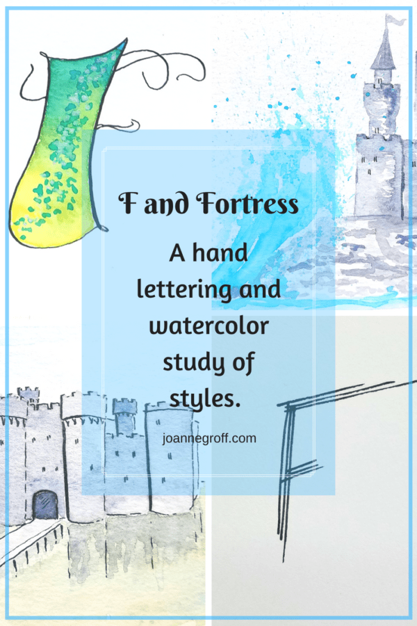
Letter F and Fortress
Letter F and Fortress
This project is part of a watercolor and ink study in letter styles and object styles beginning with that letter. Each week will focus on one letter and one object beginning with that letter in order to collect and practice various artistic styles and alphabets.
Letter F and fortress proved a bit of a distraction from learning watercolor and ink styles. Alphabet styles proceeded as usual, but I looked at so many fortresses, real and imaginary, that I simply wanted to paint them all. So, I painted several styles of castles and only a few styles of watercolor and ink.
I took the liberty to include castles as well as fortresses because castles are enchanting and because many castles were also fortresses when they were built. Being the author of the study, I thought that granted me a little leeway. F and fortress is almost like C and castles, right?
Let’s look at F and Fortress.
Dip Pen Letter F Style
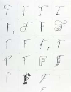
- I enjoyed F and its styles. I think I could have created several more of them.
- Improvements: 4 looks a little like an E. The bottom tail should be shorter.
- Favorites: 6, 8, 11, 18,19.
Watercolor and Dip Pen Letter F Style
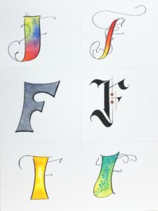
- Again, yet, still … the top two Fs on the right remain my favorite letters. I love the flourishes and bright colors of the top F and the bold statement of the middle F.
- I like the style of the lower left F and the color, but I’m not sure I like the style with the color. Maybe I would need to see a word or name with it to decide.
Fortress Styles
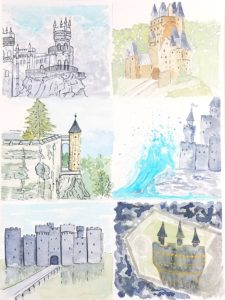
- For several of these castle fortresses, I started by looking at images. Some of them I tried to replicate in my own style. Others I reproduced pieces of them, adding my own walls, coloring, or embellishments.
- The only one I wish to improve is the abstract. I don’t know how to feel about that one yet. Sometimes, I have to let a painting sit with me for a few days before I decide if I like it or hate it.
- I got so carried away with the dip pen, that I didn’t try any loose styles this time. The fortresses had so much detail that I wanted to capture.
- I am pleased with my first attempt at a crashing wave on the middle right painting. What a lovely ink color Noodler’s Navajo Turquoise is! It gives that castle a tropical feel.
If you want to look at past letters, you can find links to them here.
What are you studying? Tag me on Instagram @joanneegroff. I’d love to take a peak.
Until then … happy creating!

Joanne Groff
Just a brainy creative with a fascination about how people think and understand. I use watercolor and letter design to encourage connection ... with self, the environment, and especially the people who live there.

