Letter J and Jellyfish
Letter J and Jellyfish
This project is part of a watercolor and ink study in letter styles and object styles beginning with that letter. Each week will focus on one letter and one object beginning with that letter in order to collect and practice various artistic styles and alphabets.
It would seem as though letter J would be one of my favorite letters. It starts my name. And I do enjoy playing with the look of it, but I must say, it can also be one of my most elusive letter styles. Perhaps I want the perfect look. The J that best represents me. After all, it’s a part of me. But how do you put all of that into one letter?
So, I end up having a love-hate relationship with J.
After a week of exploring different styles, though, I have a greater appreciation for the options J presents. Maybe that is the part of J that does represent me … I do like options.
J is a difficult letter. When we play the alphabet game on long car trips (a game where we look for the alphabet in order on signs and plates as we drive), I can be stuck on J as long as I’m stuck on Q. What could I paint that starts with J?! Jousting? Jerboa (they are funny! Long-legged mice)? Jam? Jewels?
Jellyfish! What a mysterious creature! What are they exactly? Plant or animal? They don’t have hearts or brains. How does that work? But … fun to paint? Absolutely.
Here is what I learned about letter J and Jellyfish.
Dip Pen Letter J Styles
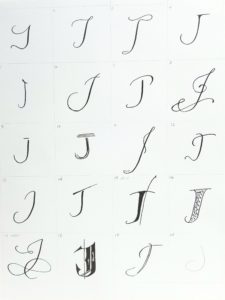
- Letter J can look so much like letter I when they aren’t side by side. I found it difficult to show that difference in some of these styles.
- Favorites: 2, 3, 6, 8, 11, 12, 17
- I don’t know how I feel about the gothic J, usually one of my favorites. I think I could improve it, but I’m not sure how. Any ideas?
Watercolor and Dip Pen Letter J Styles
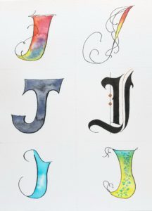
- These didn’t feel as lively as some of the other letters I’ve worked with. Did I run out of inspiration? Or am I feeling like my name deserves better?
- Favorite: bottom left. I love that blue ink! Noodler’s Navajo Turquoise
- I tried something different with the bronze on the gothic letter. I like the placement of the extra stroke, but I wonder if I should close the white gap a little bit.
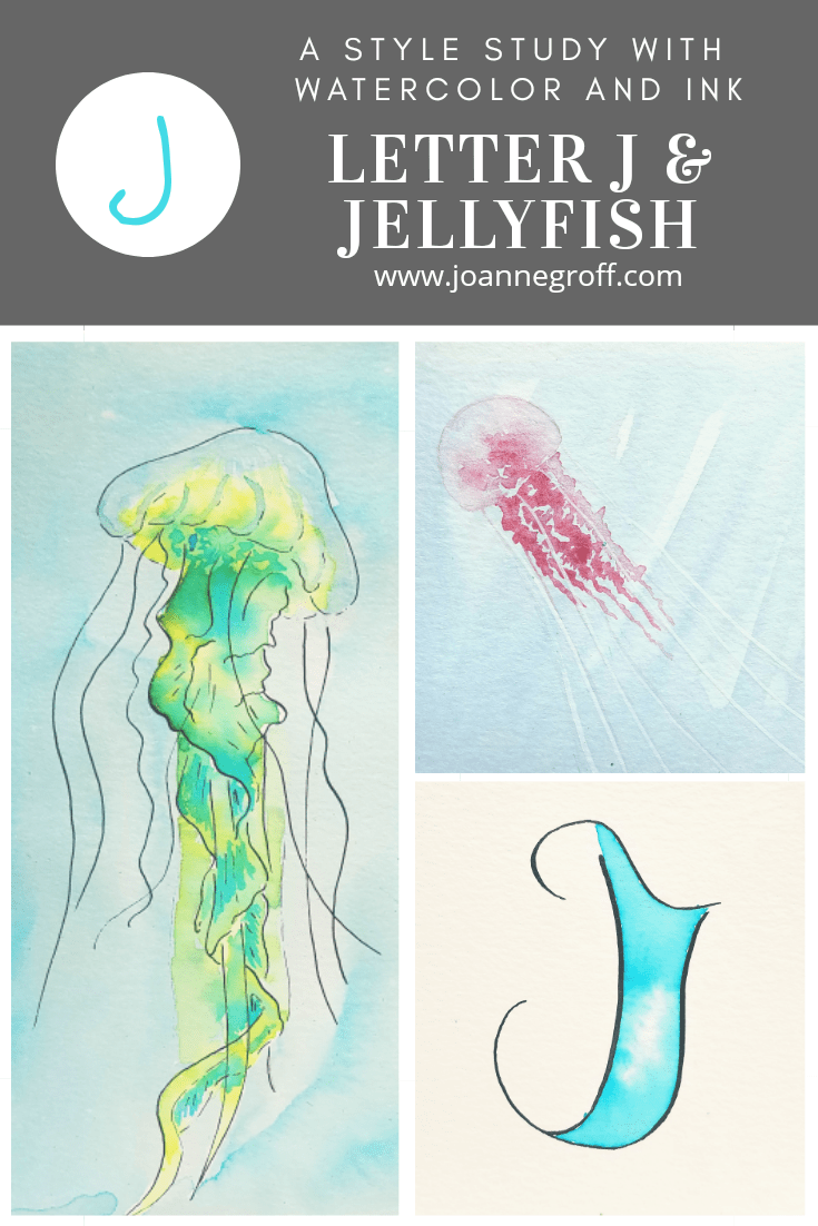
Watercolor and Ink Jellyfish Styles
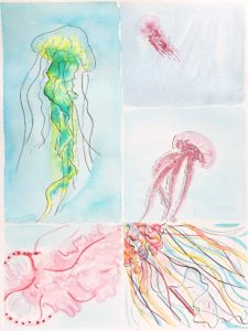
- I needed to use two boxes to draw one of my favorite jellyfish. I love the waviness of the tail. It reminds me of how a mermaid tail would look wearing an elegant gown.
- Favorites: large left, top right and middle right.
- It was interesting trying to create the translucent quality that jellyfish have. You can see the ocean through them.
- Who knew there were so many different jellyfish?! And some are deadly, deadly, deadly.
- It would be interesting to do a study on iridescent jellies at night.
How did it go with letter J? What worked for you? What didn’t? I’d love to see your most recent project! Just tag me on Instagram @the.paintedpen (Yes! I changed the name!).
If you want to see more letters from this study, you can find them here.
Until then … write it. Draw it. Dance it. Dream it.
Happy creating!
