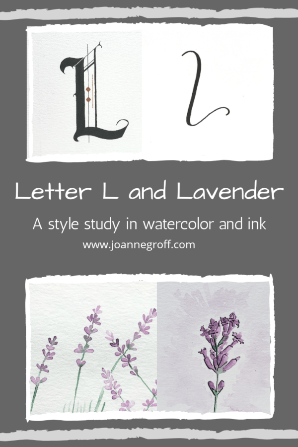
Letter L and Lavender
Letter L and Lavender
Letter L and Lavender are part of a watercolor and ink study in letter styles and object styles beginning with that letter. Each week will focus on one letter and one object beginning with that letter in order to collect and practice various artistic styles and alphabets.
When thinking about each letter, I often ask my children what they think of that starts with that letter. I like to hear different opinions. Alone, I tend to run circles around the same few ideas instead of thinking something new.
This time, lemur, lion, linx, leopard, and ladybug added some good options. But when lavender came to mind, I had to paint it. I enjoy making those tiny blossoms. As I paint, I think my of my husband’s bees happily flying from blossom to blossom and the calming scent it releases in the summer breeze. Lavender also has a delicate beauty that makes it perfect for accenting a stylized photo, giving off a rustic feel or an elegant touch.
But … surprisingly … purple ranks very low on my list of favorite colors, but lavender, the flower? A favorite. It must have something to do with the combination of other things I like about it.
I wonder what styles painting lavender will uncover. Let’s take a look at this week’s styles.
Dip Pen Letter L Styles
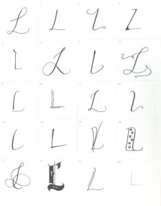
- Favorites: 8 (I tried some different flourishes, a little wild and free. I’d like to extend them beyond the box) and 16. Some other Ls that add interest are 7, 12, and 13.
- Least favorite: 10 (though this style has its place and works well used with a contrasting style).
- Style 17 looks a lot like a letter I. I think I could thicken the stroke on the bottom of the L to try to fix this problem.
Watercolor and Ink Letter L Styles
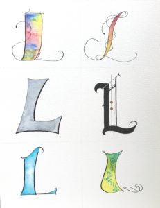
- My favorite watercolor and ink style this week is the gothic style, maybe because it took several tries before I could even like it a little. It has a gothic feel and a uniqueness.
- I don’t care for the mermaid letter L. It looks too plain. I wonder how I could remedy that. Maybe it needs a fin on the tentacles.
- As this series progresses, I find myself wanting to see these styles in use. What will they look like used on a name plaque, a book cover, or as a logo?
Watercolor and Ink Lavender Styles
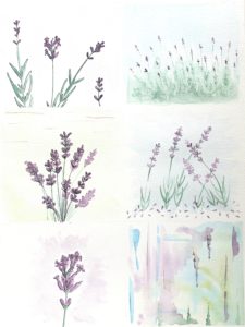
- Lavender is perfect when you want something easy to paint that will still turn out lovely. I enjoy painting it on cards to send a simple “thank you” or “I’m thinking of you.”
- Drawing and painting the open lavender blossoms required more concentration than the simple teardrop shape of the closed lavender.
- Using watercolor bleeds, I could fade the green of the stem into the purple of the blossoms, creating a nice effect.
- Usually, I have mixed feelings about my abstract in the lower right corner, but this one developed a cave-like look and feel with the appearance of a few stalactites and mites.
- I can’t pick a favorite, or maybe a least favorite, because I really like all of the styles. Which style do you prefer?
As always, I’d love to see a recent project of yours! Just tag me on Instagram @the.paintedpen.
If you’re interested in looking at letters A-K of the alphabet study, you can find links to them here.
Happy creating!
Joanne Groff
Just a brainy creative with a fascination about how people think and understand. I use watercolor and letter design to encourage connection ... with self, the environment, and especially the people who live there.

