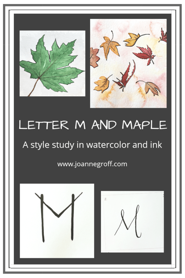
Letter M and Maple
Letter M and Maple
Letter M and Maple are part of a watercolor and ink study in letter styles and object styles beginning with that letter. Each study will focus on one letter and one object beginning with that letter in order to collect and practice various artistic styles and alphabets.
Letter M has so many possibilities. It can look pointy or rounded, symmetrical or varied, and a flourish can sprout from almost every angle.
Studying M in pictures has many options too. I added mandalas, mermaids, mountains, and more to my “study someday” list. But for this study, I chose maple … as in maple leaf or maple tree more than maple flavoring. Though, real maple syrup … pure deliciousness. If you don’t already know it, I have a slight addiction to food, especially the fresh and homemade kind. Right now, our family splurges on anything tomato from our garden … caprese salad, bruschetta, and fresh salsa are favorites that are frequently overindulged in during summertime.
Wait … back to maple. I don’t usually think about maple leaves or trees in August. They seem normal right now. Green. Just like everything else. And while I love the look of summer green, by August it fades into the background because, like I said, everything is green. So maple leaves make me think about autumn, and I don’t really want to think about things growing colder right now. On the other hand, I enjoy drawing and painting leaves, especially autumn leaves. And one of my favorite things is to walk through the leaves, listen to them crunch (in fact, I will go out of my way to crunch leaves while I walk), and smell them. Have you smelled a dry Sycamore leaf (a large maple-like leaf)? Oh, my! It smells like honey. And what a crunchy sound they make!
On to what I learned studying letter M and maple!
Dip Pen Letter M Styles
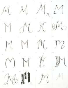
- It surprised me how many variations I found for letter M. I think I could even develop some of these styles further.
- Favorites: 2, 9, 12, 13. Style 7 is interesting, so I’m still deciding about it. And I would like style 8, but I need more practice to avoid wobbles … or more space.
- Least favorite: 3. This style just seems a little blah.
Watercolor and Ink Letter M Styles
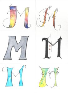
- Letter M resembles letter H in that it has two straight sides. Varying the side thicknesses appeals to me and adds a hint of character to some of the letter styles.
- The gothic letter M didn’t want to cooperate this time. It was a draw, redraw, and draw again kind of letter, but in the end, it has a classy feel.
- Favorites: the gothic style M and the left and right bottom Ms.
- I like them all, so I don’t have a least favorite.
Watercolor and Ink Maple Styles
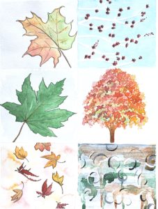
- Maple reminds me of autumn, and it was difficult to avoid all styles reflecting the fall season. I did manage to include spring and summer styles.
- Am I remembering to vary the styles? I didn’t include a loose style this time, but I think loose falling leaves could look appealing. Another study, perhaps.
- The maple tree took several layers. First, it had no depth. Then, it looked like a gumdrop. Finally, it worked.
- The abstract frustrated me. In fact, I painted translucent white ink over all of my first attempts, trying to avoid ripping it off of the page and throwing it away (The writer part of me wanted to save it. “Save everything you write for at least 15 years,” it said. I’m sure that applies to paintings too.). The final abstract is passably acceptable but I refuse to say that it’s good.
- Favorites: the left column.
I’d love to see what you’re diving into creatively! Just tag me on Instagram @the.paintedpen.
To take a peek at past studies, look here.
Happy creating!
Joanne Groff
Just a brainy creative with a fascination about how people think and understand. I use watercolor and letter design to encourage connection ... with self, the environment, and especially the people who live there.

