Letter P and Parrot
Letter P and Parrot
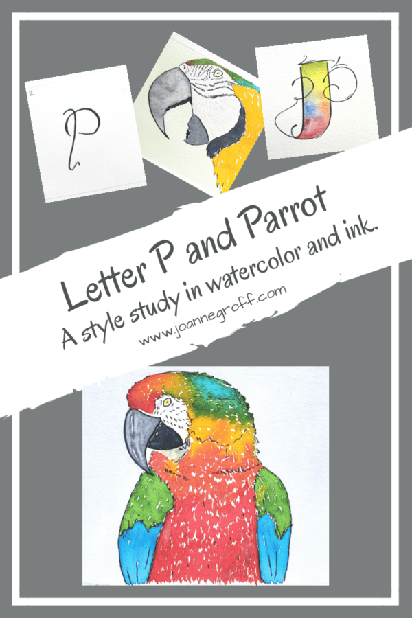
Letter P and Parrot are part of a watercolor and ink study in letter styles and object styles beginning with that letter. Each study will focus on one letter and one object beginning with that letter in order to collect and practice various artistic styles and alphabets.
Parrot belonged with letter P since the beginning of this study. It might actually have inspired it. One of my first watercolor and ink sketches was of a color wheel parrot.

Certain birds beckon for our attention. Owls with their silent, intelligent watch. Herons with their graceful, patient hunt. Parrots with their ability to imitate sounds and extravagant colors. As a young girl, I had a pet cockatiel, also in the parrot family. It could imitate our cat to the point of confusion. And yes, he could talk in spite of my lack of training him.
For a brief moment, near letter M, I considered Macaw, but I wanted to include other parrots in the study (though, in all fairness, most of the pictures are Macaws. A further study in the future?)
Let’s dive into to what I learned about Letter P and Parrot styles.
Dip Pen Letter P Styles

- P is for practice. I’ve been practicing alphabets and strokes with a dip pen in the late evening hours (when my brain has stopped thinking productively but I’m not ready to go to bed) in hopes that the line wobbles will decrease. I think it’s helping.
- Favorites: 2, 3, 6, 8, 11, 12, 18. With so many favorites, it seems Letter P has lots of potential.
- Least favorite: 13. I’m not a fan of it’s toupee.
Watercolor and Ink Letter P Styles

- The potential continues as it’s difficult to find a favorite among favorites. With Letter P, it’s easy to see the striking difference among the styles and yet … all the same letter.
- The top left P shows off its playfulness.
- The top right displays striking fire and flourishes.
- The gothic P exudes a personality all its own with a bit of shimmery flare.
- The bottom right looks like it will swim away with the mermaids.
Watercolor and Ink Parrot Styles

- Watercolor and ink have some similar qualities. Many inks can act like watercolor in painting, lightening with the addition of water. But the inks that I’ve tried, far outshine my watercolors in brightness. When painting parrots, this matters. I wanted the brightest bright. Most of the colors on the styles are ink or watercolor mixed with ink.
- Favorites: top left and right, middle right, and bottom left.
- Least favorites: the middle left and abstract.
Which letter P and Parrot is your favorite? What would you study that starts with the letter P? I’d love to read your feedback in the comments below.
If you are new to this study and interested in past letter studies, you can find links to them here.
Happy creating!

Joanne Groff
Just a brainy creative with a fascination about how people think and understand. I use watercolor and letter design to encourage connection ... with self, the environment, and especially the people who live there.

