Calligraphy Alphabet
a new letter style starts with one letter
Sometimes … okay, often … I get tired of writing in the same letter style. I love to explore different ways to write the same words, in as many calligraphy and lettering styles as possible, and I have many calligraphy alphabets that I rotate between.
Maybe you feel stuck in one calligraphy style and would like to develop a new calligraphy alphabet for yourself. If so, you’re in the right place. I’ll show you how I work through developing a new calligraphy letter style. You can apply the concept to any kind of lettering, using any tool you have.
When developing a new lettering style, it’s helpful to think about one letter rather than all of them together. You might want to think about one of your favorite letters, one of your problem letters, or a letter you’ve recently come across that you admired. But start with one letter.
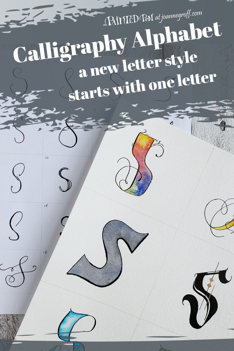
First, write the letter the correct way, the way you first learned how to write it in grade school. I like the flow of the letter S, so I’ll use it as I demonstrate how I create a new lettering style.
Next, relax a little and write the letter in your normal handwriting.

Lean back a little and notice the differences between the “right” letter s and your letter s. Name them.
Letter Differences I Notice:
- The “right” letter S is symmetrical, top to bottom. My letter S is not.
- The “right” letter S is thinner than my letter S.
- The top of my letter S sometimes touches (or at least gets close to touching) the middle curve.
These differences will show you areas that you can change in your letters while still maintaining readability. Readability is important for me when I develop different letter styles. The style isn’t more important than the message. It accentuates the message.
From the differences I noticed between a correct letter S and my handwritten letter S, I know that I can change the symmetry of a letter or the parts of a letter that look perfect. I can also change whether a letter is thin or fat and some of a letter’s stylistic elements.
Write down categories from the differences you noticed between your handwritten letter and the correct letter. These categories will help you keep your calligraphy alphabet consistent as you develop their style.
Brainstorm more letter characteristics that you could change.
Here are the letter style categories I came up with:
- Big top (exaggerate the top)
- Big bottom (exaggerate the bottom)
- Curvy (add curves in different places)
- Vary thickness (change where a letter is thick and thin)
- Skinny
- Fat
- Fancy
- Bold or block (outline a letter in a block style or make it bold and black)
- Slant (left, right, or straight)
- Extras (for ideas that don’t fit into a category)
Sketch out several different styles of the same letter for each category. Use a pencil so you can adjust a letter as you decide what you like and don’t like about each letter. This will help you get a lot of style ideas before you choose one to develop into a calligraphy alphabet.
Letter S in New Letter Styles

Sketch out several different letter styles for each category. It’s amazing how many different letter styles can come from one trait. 
I made a worksheet to help you develop a new letter style from one letter. It’s free for email subscribers in the Resource Library.
When you have all of your style ideas on paper, choose one to develop. A new calligraphy alphabet starts with one letter in one style. (A New Letter Style worksheet is available free for email subscribers in the Resource Library. Print one for each letter!)
Think about the parts of the letter that you like and want to keep consistent. If it helps you keep them in mind as you create more letters, you can write them down.

I like that this letter S has a loop and smooth, soft curves. Those are the characteristics I want to show up in some other letters as I draw them.
Use a pencil to start your alphabet. It’s fine to draw and redraw letters as you go. This is the editing phase. It’s highly unlikely that you will like the first draw of all of your letters. And starting with a pencil will help you become familiar with your new calligraphy alphabet.
But how do you keep those characteristics consistent throughout the alphabet?
Loop Letters
Look for the letters that could have a loop. I can visualize a loop on B, D, E, O, Q and of course an S. Some of the low hanging letters, like G, J, and Y could have a loop too.
Smooth, Soft Curves on Letters
Which letters could be softened with curves? Which are usually pointy? Here are the letters that I think of with hard edges: A, I, L, M, N, U,V, W, Y and Z. Let’s try to soften those points.

Put it Together
Now, let’s put the whole alphabet together and see what it looks like. Go ahead and adjust the characters that don’t feel like they fit. I reworked letters D, M and N a few times before I found a form that fit with the overall style of the calligraphy alphabet.

When you have your capital letters finished, start with your lowercase letters. Use the same technique keeping the same characteristics consistent to make sure they fit the calligraphy alphabet style. Notice the loops and smooth curves in the lowercase alphabet above.
Finally, try some words with your new lettering style.
Try ways you can change some of the letters slightly while still maintaining the consistent style to give your lettering a more organic feel. Like this …
If you want to see me write out the entire calligraphy alphabet in this style, you can find it on The Painted Pen YouTube channel.
Now you have a whole new lettering style to work with and the ability to make more styles.
This is just the beginning; the possibilities are endless.

Happy Creating … and remember …
Write it! Draw it! Dance it! Dream it!

Joanne Groff
Just a brainy creative with a fascination about how people think and understand. I use watercolor and letter design to encourage connection ... with self, the environment, and especially the people who live there.

