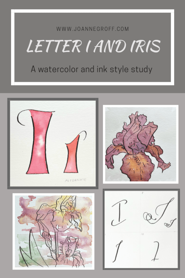
Letter I and Iris
Letter I and Iris
This project is part of a watercolor and ink study in letter styles and object styles beginning with that letter. Each week will focus on one letter and one object beginning with that letter in order to collect and practice various artistic styles and alphabets.
Letter I is a hard letter to work with. Not only is it limited in its strokes, but not many nouns start with I. I found myself stuck in a box of ice cream, icicles, and igloos. Not what I wanted to paint at the start of the heat of summer. Though maybe painting those things would cool me off.
Then, my mother-in-law sorted through a bed of irises and asked me if I wanted any of them. I remembered the irises my mother grew when I was a child and the small patch I had when we lived in the restored home of my husband’s grandparents. I remembered the colors … and the smell. I have read that a smell can transport you to a memory from your childhood. Thinking about irises certainly did for me, and I knew what I word would be part of this week’s study. The only other dilemma would be choosing the colors.
Here is what I learned about letter I and Irises.
Dip Pen Letter I Styles
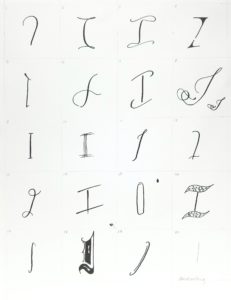
- Letter I felt a little limited in the dip pen styles. I could mess with the look of the flourishes or the top and bottom crosses, depending on the style, but I had to be careful that the liberties I took with the I didn’t make it look like a J (like in 8) or a Z (like in 4).
- Some of my Is had an unfinished look (6 and 19). It would be interesting to put them with a word to see if they still looked unfinished.
- Favorites: 1, 3, and 11.
- Least favorites: 12 and 15.
Watercolor and Ink Letter I Styles
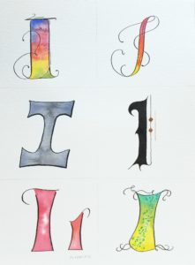
- Unlike the dip pen styles, I did not find the letter I limiting in the watercolor styles. I loved working with the different accents in each style and felt happy with the results for all of them.
- Favorites: All of them, though the gray a little less.
- I keep thinking I should create a black and white printable for these styles to try different colors for each of them.
- I tried one alternate letter for one of the styles, with a different top and a slightly different shade of red.
Watercolor and Ink Iris Styles
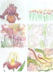
- Some of my favorite irises are burgundy. Some of them have yellow parts, and some of them do not. Starting out, I didn’t have a burgundy watercolor paint tube, and I wasn’t sure if I could mix it. But in the end, I’m happy with the shades that came with my blend-and-test trials.
- The dip pen, with its thick and thin strokes accented the drawings of the irises well, adding to the delicate beauty of them.
- Favorites: the top two and the bottom left.
- Least favorites: the loose iris (middle right) and the abstract (bottom right). The loose style turned out too loose, and the colors were too light. The abstract did not come together the way I wanted it to, and I struggled to add a focal point making it hard to know where my eyes should land.
- I loved the dip pen drawing of the middle left, but I’m not sure how I feel about the colors over it. Perhaps I should have used some brighter colors: pink, green, and teal.
I’m so glad you took a look at my style journey. I’d love to hear your thoughts on the process. What do you like about the study? What could I add to make it more fun for you? Comment with your suggestions below.
If you’re curious about past letters, you can find links to their posts here.
I’d love to see what you’re working on, even if it’s not this style study. Just tag me on Instagram @joanneegroff.
Happy creating … Write it, draw it, dance it, dream it.
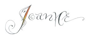
Joanne Groff
Just a brainy creative with a fascination about how people think and understand. I use watercolor and letter design to encourage connection ... with self, the environment, and especially the people who live there.

