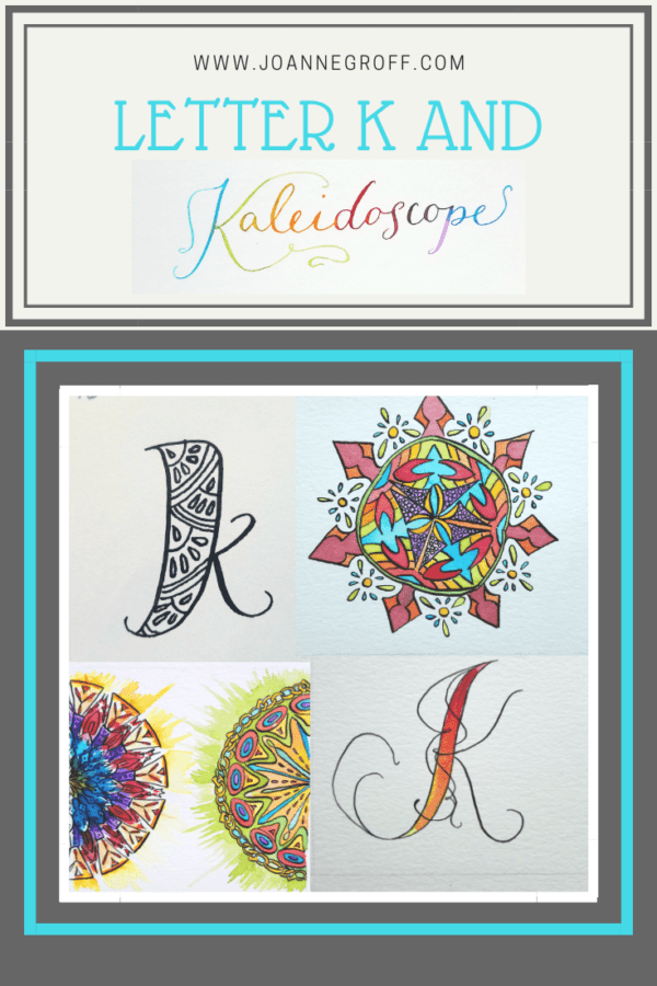
Letter K and Kaleidoscope
Letter K and Kaleidoscope
This project is part of a watercolor and ink study in letter styles and object styles beginning with that letter. Each week will focus on one letter and one object beginning with that letter in order to collect and practice various artistic styles and alphabets.
As you may have noticed, I took some time off from this lettering and watercolor study before starting letter K. I plan to adjust the time frame of the rest of the study to allow for other projects that pop up, to get myself organized for future blog posts, and to do additional planning for the days/weeks/months ahead. Instead of posting one alphabet letter a week, I will post updates on the study every other week. I know, I know … that means I won’t finish the alphabet until February.
I enjoy art because it helps me take a breather from the rest of life’s busy schedule. There’s no need to hustle through art or learning. So, yay for the study and yay for additional projects popping up. When things change, sometimes we need to change with them.
What words did I consider for the letter K? Kangaroo, koala, kale, killer whale, and kaleidoscope to name a few. I may need to hold onto killer whale for a future study. Sea life. I do love the crashing of waves mixed with sun and glistening water.
The lure of the colors and patterns of kaleidoscopes chose for me. K and kaleidoscope it is!
Here is what the study looks like.
Dip Pen Letter K Styles
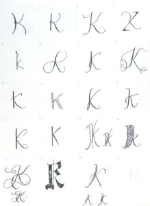
- As I started with letter K dip pen styles, I found it challenging to think outside of the normal Letter K. All of my lines wanted to stay typical, especially when working with flourishes.
- In the end, I managed to find a few favorites: 7, 11, 12, 16, and 18.
- Letter K is one of my most difficult script letters. It often gives me fits. Perhaps I have a picture in my mind that I cannot replicate?
- Least favorite styles: 1 and 13.
Watercolor and Dip Pen Letter K Styles
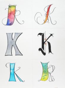
- Finally, that normal-letter-K box opened up with some more character. I just needed to add some watercolor to my ink.
- I love the variety of K shapes I found for this style set … the loopy top of the top left K, the twirls of the bright top right, the shade and boxy middle left, those bold gothic nuances in the middle right, the cheeky flair of the bottom left, and the whimsy bottom right.
- I’ve started scanning each letter sheet before I add color. Maybe I can try some different color combinations in these styles later.
Watercolor and Ink Kaleidoscope Styles
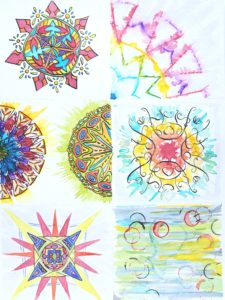
- Sometimes, after I’ve worked with the dip pen on my drawings, I want to stop and keep them black and white. I struggle to push myself to add color because I’m not sure what it will turn into or if I’ll like the result as much as the black and white. (Maybe I should scan these images too)
- I wanted to use my inks for these kaleidoscopes. Their colors and brightness beckoned to me, especially paired with the kaleidoscope designs. The drawback? Many of my inks are sensitive to light and will fade with time.
- The abstract piece always mystifies me. I usually have no idea what to paint, but that’s also part of the appeal of it. It’s a section of complete play, an attempt to leave inhibitions behind. I didn’t like my abstract until I added my last layer. Until then, I was sure it was a complete loss.
If you’d like to see other letters from this study, you can find their links here.
I’d love to see your most recent project and hear about your process! Just tag me on Instagram @the.paintedpen (I changed the name but the content stayed the same!).
Write it. Draw it. Dance it. Dream it.
And … Happy creating!
Joanne Groff
Just a brainy creative with a fascination about how people think and understand. I use watercolor and letter design to encourage connection ... with self, the environment, and especially the people who live there.

