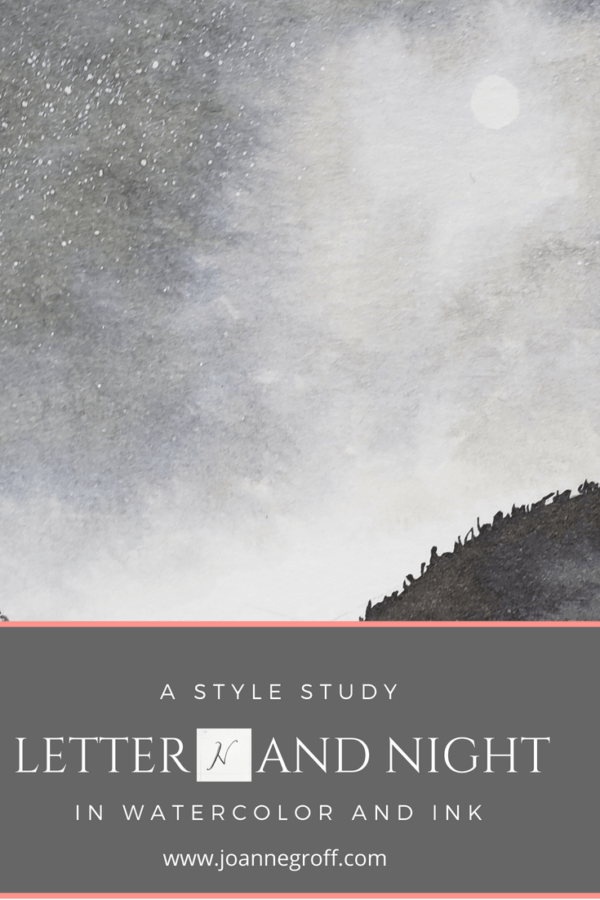
Letter N and all things Night
Letter N and all things Night
Letter N and night are part of a watercolor and ink study in letter styles and object styles beginning with that letter. Each study will focus on one letter and one object beginning with that letter in order to collect and practice various artistic styles and alphabets.
Are we at Letter N already? That means we passed the halfway mark. And what a week to creep over the hill! I have thoroughly enjoyed playing with galaxies, stars, and all things night. This study could go much farther, as far as the imagination, but I’ll stick with what I have for now.
The runners up for letter N? Narwhal (what an interesting creature with that long tusk) and Note (the musical kind). Yes, the study played limbo until the last possible moment. The reason? Fear. I wasn’t sure I could actually paint these watercolor night scenes. I must have forgotten that studying is for learning.
Do you want to hear something else that’s funny? After finishing all of my N letters, I happened across a video talking about how to draw an N correctly. Now, I’m the kind of person who likes to do things my own way, but after watching the video and looking over my painted Ns, I realized that sometimes, it matters how I draw an N. Some of my Ns don’t look like Ns because I put too much weight on the sides of the letter without enough weight in the middle of the N. Take a look and see what you think as you meander through what I studied this week.
Dip Pen Letter N Styles

- Favorites: 12 and 19. Several Ns have potential, and some have character. But Letter N was difficult to work with. It didn’t want to balance as nicely as M, and most of the styles just felt pretty ordinary.
- Where you put the thick strokes matters.
- I have not developed a satisfying script N.
Watercolor and Ink Letter N Styles

-
Again, where you put the thick strokes matters with N. You can see it with more clarity in these painted letters. Several (the top two and the bottom two) of the Ns look like an H that I bumped, knocking the middle line off kilter. They need a re-do.

- The two middle Ns on the first set pass for normal. I think the slight thickness of the gothic N gives it enough depth to make it decipherable. Actually, I’m happy with how they look, and the gothic N proves that the weight rule isn’t 100%.
Watercolor and Ink Night Styles

- Favorites: The top two and my galaxy owl. Throughout the layering process, I didn’t know if it would come together. A little time and a little drying later, and I loved the results.
- I like the idea of the middle left picture … a misty night … but I feel I can improve the mechanics of the painting.
- The campfire makes me think of summer weekend evenings. We enjoy a good cookout. And the shimery gold sparks add character. You can’t see the gold from this angle.
- I don’t know if I like the abstract, but I enjoy the effects of dabbing acrylic ink into water. Look at those branch-like veins that sprouted from the dab!
What have you been working on lately? I’d love to see your creative projects. Just tag me on Instagram @the.paintedpen.
As always, if you are interested in past letters, you can find the links for them here.
Happy creating!

Joanne Groff
Just a brainy creative with a fascination about how people think and understand. I use watercolor and letter design to encourage connection ... with self, the environment, and especially the people who live there.

