Letter Q and Quill
Letter Q and Quill
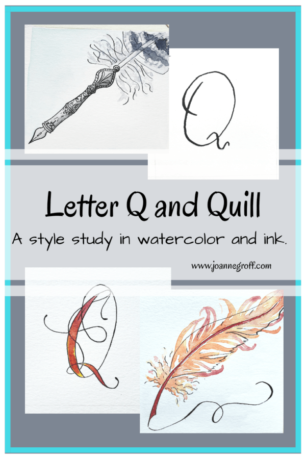
Letter Q and Quill are part of a watercolor and ink study in letter styles and object styles beginning with that letter. Each study will focus on one letter and one object beginning with that letter in order to collect and practice various artistic styles and alphabets.
Letter Q almost led to my alphabet study downfall. (Letter X may be the next terror.) If there ever was a letter to skip … I mean, how do you paint words like quirky, quiet and quintessential? I thought about queen, but I didn’t really want to paint six queens … maybe a queen’s crown. Yes, drawing and painting those intricate designs has appeal. Queen Anne’s Lace could be interesting but very plain in its natural colors, white and green. But it’s art. I don’t have to do natural colors. That’s part of the beauty of art.
Finally, I decided to take a step back in time to quill. Perhaps the Renaissance Faire I attended with my son and his classmates influenced my choice. We walked into a makeshift Abbey, selling quills with nibs alongside ink and wax seals. So tempting.
Or maybe I secretly (or not so secretly) wish I could hop into the story of Harry Potter to experience Hogwarts … during one of the safer years, of course.
Either way, I wonder what it would be like to write with a quill. Would it flex too much or not enough? Would it snag and blot? How well would it hold the ink? But that may need to be another post for another day.
Today, let’s look at what we discovered about Letter Q and Quill.
These reviews help me step back and notice things about my own work. Sometimes I’m too close to what I’m doing to think about what I like and don’t like about the pieces I’m working on. From this exercise, I know where I need to polish a style or stroke and what I should keep in my “I love it! Do it again!” idea file.
Dip Pen Letter Q Styles

- I really wanted to find a flourished Q that I liked. Styles 8 and 17 get close, but need a some refining.
- Favorite styles: 9, 12, 14, 19.
- Least favorites: 4, 10, 13. Though it will be interesting to see if I change my mind when I see each complete alphabet style together at the end of the study.
Watercolor and Ink Letter Q Styles

- In the top left Q, the colors got a little muddy. Having worked with color wheels, I should know better. Sometimes, I start playing and forget learning. Yes, mixing orange and blue will make mud.
- Favorite styles: the whole right column. I like how the flourishes turned out on the top Q, the sheen on the middle Q and the sea feel on the bottom Q (though, tell me … does the bottom one look like a Q? I can’t decide).
- Least favorite: top left mud face Q. The design is okay, but I can’t see past the mud on its face. LOL.
Watercolor and Ink Quill Styles

- What fun to paint quills! And I managed to get a few different styles mixed in which may have been somewhat missing in previous studies.
- It’s difficult to pick a favorite, so I’ll just write things I love about some of them.
- The free and loose feel of the top right and middle right adds to its character. I enjoy doing realistic ink sketches under loose watercolors, it gives a level of playfulness to the piece.
- Peacock feather … need I say more?
- The intricacy of the bottom left quill leaves me wishing it would jump off the page so that I can use it.
What topic would you study with the letter Q? Do share them in the comments! I’m always looking for future ideas.
If you are interested in past letters from this study, you can find a list of them and their links here.
Happy creating!


