Letter S and Seasonal Scenery
Letter S and Seasonal Scenery
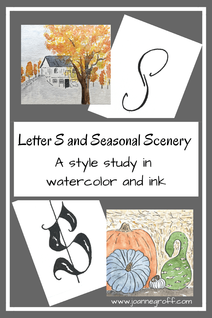
Letter S and Seasonal Scenery are part of a watercolor and ink study in hand lettered styles and object styles beginning with that letter. Each study will focus on one letter and one object beginning with that letter in order to collect and practice various artistic styles and alphabets.
This time of year begs to be painted. Colors. Pumpkins. Leaves falling. And the colors keep changing …
As I flipped through the long list of options for letter S (seriously the list of animals alone goes on and on), I wanted to find something that fit the season.
Originally, I’d chosen steeple for letter S. Have you looked at some of the steeples around you?! Some of them have a quaint simplicity and others call for awe at the intricate designs. And I haven’t done a building since Letter F and Fortress. I will need to do a building again … maybe another study series.
I painted Letter M and Maple this summer and thoroughly enjoyed it, but I couldn’t settle on anything S for fall. Would Squash pass for pumpkin? Maybe, but then I wanted to paint leaves and trees that contrast with the gray sky. That’s when I thought of Letter S and Seasonal Scenery.
Here is what I learned.
Dip Pen Letter S Styles

- Letter S seemed like it would mimic the letter C all over again. I wasn’t sure I would find much variety with it. Sometimes I like it when I’m wrong because as I looked at each style and tried to draw something consistent, I found that letter S had a lot of possibilities.
- Favorites: 3, 9, 13, 18, 19. I love the spunkiness of the bold 18!
- Least favorite: 16. I think I could improve it by extending the decorated area of the S. It looks top-heavy the way it is now.
Watercolor and Ink Letter S Styles

- These letter S styles have some real character. Color adds a whole new feel to a style.
- I kept some of that spunk from the bold dip pen letter S for the bold ink S here. It reminds me of a skunk, but I still really like how it turned out. That bold letter always seems to catch the eye first.
- These are all favorites. No least favorites, so that feels like an accomplishment.
Watercolor and Ink Seasonal Scenery Styles

- Did I mention I like painting fall things? I like painting fall things. Just so we’re clear on that.
- If I didn’t tend toward bright, bright colors so much, fall colors would be my favorite hues.
- I love all of these fall scenes, though I think I can keep working on my fall trees. It’s an improvement from the Maple study, but still lacks something.
- The designed pumpkin may need to be part of further projects. It has potential for some lovely decorations.
Which letter S and/or Seasonal Scenery style is your favorite? Is there a scene that you would add that speaks of fall to you? Please share your thoughts in the comment section below. I’d love to hear your responses and ideas.
If you just joined the study, you can find links to previous letters here.
Until next time …

Joanne Groff
Just a brainy creative with a fascination about how people think and understand. I use watercolor and letter design to encourage connection ... with self, the environment, and especially the people who live there.
