Love Them or Hate Them? Paul Rubens Watercolors Review
Paul Rubens Art asked me if I would like to try their watercolor paints in exchange for a review. I love trying new paint and comparing it to what I use already, so of course I said, “Yes!” Let’s find out if I love them or hate them.
Are you ready to find out what I think about Paul Rubens watercolor paints? Me too. I mean, what are we waiting for?!
I started this review by creating a color chart and ended with a cute little painting. You’ll get to see what the colors look like straight from the tube to translucent on the chart. In the painting, you’ll see how they look after I use several different techniques: in a calligraphy pen, in a sprayed wet-on-wet watercolor background, and with a brush in the painting itself.
Keep reading to find out the details or jump to the video to hear about the highlights.
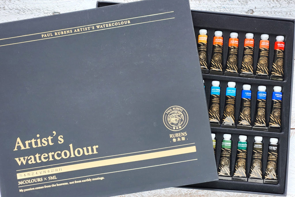
Paul Rubens Artist’s Watercolors
This is the set of Paul Rubens Artist’s watercolor they sent me. Yep … 36 different artist grade colors in 5ml tubes. Colors make me so happy.
Here are the links if you’d like to try them yourself:
- US: https://bit.ly/459DOsY
- UK: https://bit.ly/3M9WBM8
- CA: https://bit.ly/3WdwybK
- EU: https://bit.ly/3MyP37e
I wonder if the colors on the labels match the colors inside.
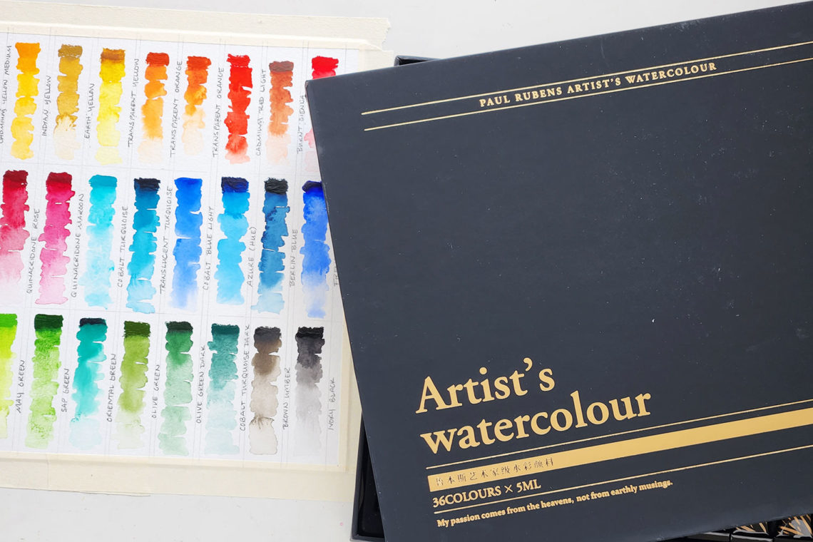
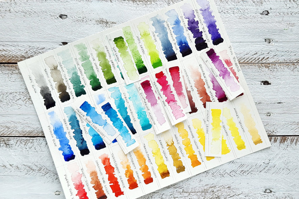
Color Chart Magic
When I get new paints, I like to make a color chart to tuck inside the top of the box or tape inside the cabinet door where I keep all my supplies. I can see the paint colors on the labels on the tubes, but sometimes those label colors don’t look the same when used on watercolor paper. And they don’t show how the color changes when diluted with water. A color chart makes a quick and easy reference for choosing colors when I’m ready to paint.
To make the color chart, I took some of the paint from each color directly out of the tube and painted it on the rectangle labeled with the name of that color. Then, I swished my brush in water and painted a little bit below the paint straight from the tube. It’s okay if it mixes. In fact, I wanted to see what that looked like. Then, I swished my brush a little more in the water and painted below the new section. From there, I repeated until I ran out of paint in my brush or space in the rectangle. Now that it’s dry, I can see how each color looks as it gets more transparent (aka as I add more water to the paint).
It took me a little while to set it up and paint it, but the results are so satisfying. I get color happy every time I look at it.
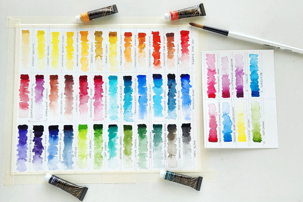
Colors to Compare
While I was making the chart, I decided to choose a few colors from my well-loved supply to use as comparisons to the Paul Rubens paints. I wanted to see if they came close to any Paul Rubens colors and how the pigment and transparency of the different brands compared.
Most of the time, I use Winsor & Newton Cotman paints, student grade quality, because the majority of my artwork ends up printed on products. I paint, scan it into my computer, and print it from there. But when I paint originals, I use a very limited supply of Winsor & Newton professional watercolor (or my stray tube of Daniel Smith extra fine watercolor) and mix my way to the colors I want. Did you know you can mix most colors if you start with red, yellow, and blue? (If you want to learn a little bit about that, you can read this post. It’s an old one, but you’ll learn the basics of mixing colors.) I want to note, too, that most of the Paul Rubens watercolors are single pigments, making them perfect for mixing new colors without getting a muddy look.
Below, you can see some of the colors I often use next to similar colors from the Paul Rubens watercolor set. As you look, see if you can find differences between them. Look at the shade of the color, the translucency, and the amount of pigment. See how smooth the blending is?! Very similar to the paints I already use.
Thoughts on the Watercolor Set
One interesting thing about the set I received is that it had two tubes of exactly the same color, Translucent Orange. Now, I’m curious … do people use a lot of that color, or was that a mistake? I’m sure it was a mistake because the product listing says there is also a Chromium Orange, which I did not have in my box.
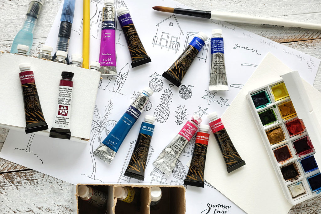
Colors on a Beach Hut Painting
As a final test of the paint set, I decided to paint a beach hut. I normally use ink for the lines, but for this review, I used watercolor instead of ink with a calligraphy pen. Then, I used a wet-on-wet technique to see how the paints blend as a background, and finally, I used my brush to add some layers. You’ll see what I mean in the video below. I’ll draw and paint the whole thing very quickly, then talk about the results.
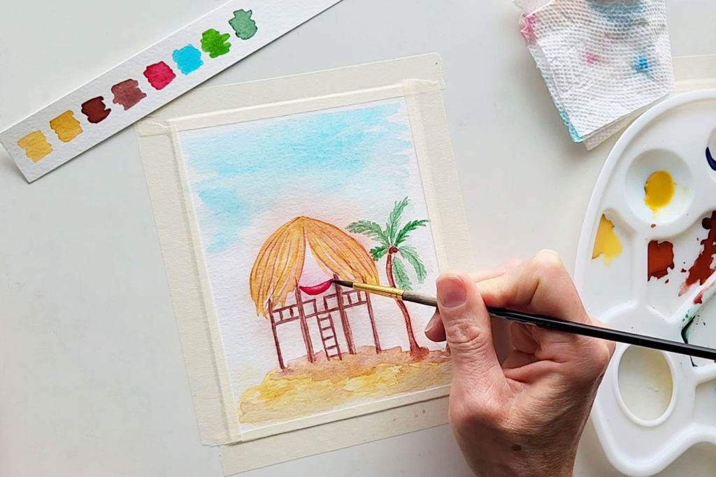
Here are a few observations.
- The pigments in the paint were fine enough to use instead of ink in my calligraphy pen. They didn’t clog the pen but created nice clean lines.
- In the wet-on-wet technique, the paints blended smoothly within single colors and between multiple colors. When using just a tiny bit of paint, the translucency was just what I wanted to add a little color to the background.
- Each color had lots of pigment. In the video, you can see that I use a paper towel at times because I accidentally grabbed a little more paint than I wanted to add to the water.
- I was impressed with the brightness and quality of the Paul Rubens watercolors as well as the variety of colors in this set.
- I love that there was no white in the set. I find most watercolor whites to be too translucent to be useful. After all, the paper is the real white in watercolor painting.
- If I could add one more color to this set, it would be a gray. I do love a nice Payne’s Gray.
And the verdict on Paul Rubens Watercolors is …
I love them.
I still love my Winsor & Newton watercolors (both Cotman and Professional), but I might like the Paul Rubens just as much. They are lovely paints with a beautiful selection of colors, and I would recommend them to any artist friend looking for new paints.
Watch My Paul Rubens Watercolors Review as a Video
Have you tried Paul Rubens watercolor paints? Share your experience with them in the comments. And … thanks for reading!
Joanne Groff
Just a brainy creative with a fascination about how people think and understand. I use watercolor and letter design to encourage connection ... with self, the environment, and especially the people who live there.
