Fall Quotes, Calligraphy Styles, and Watercolor Backgrounds
Choose your favorite fall quotes, mix in some different calligraphy styles, and add a couple of fall watercolor backgrounds. Find them all in this tutorial.
We must have had the perfect mix of hot and cold, wet and dry this summer because we are having one beautifully colorful fall. We needed an amazing fall this year. I needed it as a reminder that good things exist in the midst of difficult times.
Today, I want to capture some of that beauty, some of that reminder, in color and sentiment and style, in other words, watercolor, quotes, and calligraphy.
We’ll paint a watercolor background using two different methods. Then, I’ll show you three of my favorite fall quotes, each written in a different calligraphy style. After that, it’s up to you to put them together (but I’ll show you a some pictures of how they might look layered).
Here’s the video to get you started. Then, I’ll follow up with the details and some extra hints.
Gather your supplies

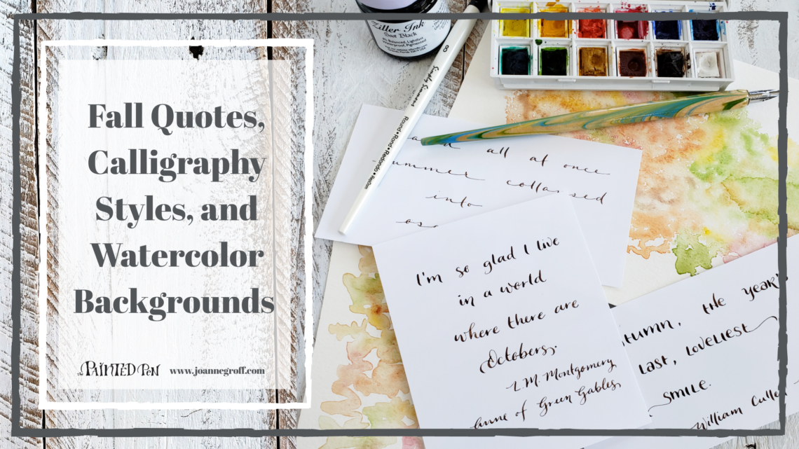
- Basic calligraphy supplies with Ziller Soot Black Ink
- Basic Watercolor supplies
- Winsor & Newton Cotman Sketcher’s Pocket Box, for fall colors
- Inkfurie’s LetterInk guide, optional
- Spray bottle with water
Watercolor Backgrounds

Tape your watercolor paper to a hard surface. This will help it dry flat.
For these watercolor backgrounds, I used fall colors straight from the Winsor & Newton Cotman Pocket Box: cadmium yellow hue, cadmium red pale hue, alizarin crimson hue, sap green, yellow ochre, burnt sienna, and burnt umber. You can mix your own fall colors if you prefer.
When I paint these backgrounds, I use a lot of water and keep the colors light. This allows it to stay a background and not compete with the lettered quote.
HINT: Work wet. As soon as the paint dries in an area, it will no longer blend with the colors around it. But as long as the area is wet, you can add a bit more color to deepen it or allow a new color to blend slightly with the colors around it. Just be careful not to blend too much or you’ll lose the colors completely.
Method #1
Move your brush back and forth, leaving lots of white space, while changing colors frequently. This method will give the background a colored leaf look as you paint. (I call this technique lazy stippling. To learn more about it, read How to Use Stippling for Watercolor Texture.)

Leave lots of white area as you paint the background to help give a falling leaves feel. 
As long as the area is wet, you can keep adding extra color.
Method #2
Use a spray bottle of water to wet your paper. Then, tap the paint into the sprayed water. This method changes the edges of your background because the mist collects more in the center of the background.
Let them dry completely and keep them taped until the paper flattens out again (it can warp while using so much water). Remove the tape carefully.

Use a spray bottle to spray water on the watercolor paper before you add color. 
Tap paint into the misted water to create the watercolor background.
Fall Quotes and Calligraphy Styles
Now for the calligraphy. I chose three of my favorite fall quotes to show you three different calligraphy styles. You can try one of these styles or choose your own favorite style.
Hint: I usually use Ziller ink on top of watercolor because it doesn’t bleed (Sumi tends to bleed on watercolor backgrounds).

Style #1
When working with calligraphy or lettering styles, I first think about the similarities that I want to incorporate into the style (for more about this, read Calligraphy Alphabet: a new letter style starts with one letter)
For this tutorial, you can start by looking at the styles I’ve provided. But if you want to come up with your own style … do it.

What characteristics are consistent through this calligraphy style? Look at the picture above as you think about this for each style.
- Thick downstrokes
- Casual feel
- There is a mix of printed and script letters.
Style #2
Let’s try the same exercise for the next two styles.
What characteristics stay the same throughout the calligraphy style?
- The letters are similar in height.
- Thick downstrokes
- There is a mixture of capital and lowercase letters.
- Some words in the beginning or end of a line have an extra swoop.
- Playful feel
Style #3
What parts of the calligraphy style are the same throughout?
- Thin downstrokes
- Small script letters
- The letters are spread farther apart.
- Casual feel
Try several styles on your quotes before deciding which ones to use for your final design.
Put it Together

Try different calligraphy styles on each style of background. 
Layer your calligraphy on top of each watercolor background.
Hint: It can be helpful to use a lightbox to transfer your calligraphy in pencil onto your final paper. It allows you to center the quote and keep it straight while you can still use an eraser.
Now, you have a meaningful and beautiful reminder of fall to decorate your home or give to a friend.
Happy fall!

If you want more fall tutorials, you might want to try
And remember … you can have these tutorials delivered to your inbox every other week when you sign up for Blots & Jots updates.
Joanne Groff
Just a brainy creative with a fascination about how people think and understand. I use watercolor and letter design to encourage connection ... with self, the environment, and especially the people who live there.

